Quickstart#
We begin with a straightforward example: PCA (EOF analysis) of a 3D xarray.Dataset.
Import the package#
We start by importing the xarray and xeofs package.
[1]:
import xarray as xr
import xeofs as xe

xr.set_options(display_expand_attrs=False)
[1]:
<xarray.core.options.set_options at 0x7fa282d028d0>
Load the data#
Next, we fetch the data from the xarray tutorial repository. The data is a 3D dataset of 6 hourly surface air temperature over North America between 2013 and 2014.
[2]:
t2m = xr.tutorial.open_dataset('air_temperature')
t2m
[2]:
<xarray.Dataset> Size: 31MB
Dimensions:  (lat: 25, time: 2920, lon: 53)
Coordinates:
  * lat      (lat) float32 100B 75.0 72.5 70.0 67.5 65.0 ... 22.5 20.0 17.5 15.0
  * lon      (lon) float32 212B 200.0 202.5 205.0 207.5 ... 325.0 327.5 330.0
  * time     (time) datetime64[ns] 23kB 2013-01-01 ... 2014-12-31T18:00:00
Data variables:
    air      (time, lat, lon) float64 31MB ...
Attributes: (5)Fit the model#
In order to apply PCA to the data, we first have to create an EOF object.
[3]:
model = xe.models.EOF()
We will now fit the model to the data. If you’ve worked with sklearn before, this process will seem familiar. However, there’s an important difference: while sklearn fit method typically assumes 2D input data shaped as (sample x feature), our scenario is less straightforward. For any model, including PCA, we must specify the sample dimension. With this information, xeofs will interpret all other dimensions as feature dimensions.
In climate science, it’s common to maximize variance along the time dimension when applying PCA. Yet, this isn’t the sole approach. For instance, Compagnucci & Richmann (2007) discuss alternative applications.
xeofs offers flexibility in this aspect. You can designate multiple sample dimensions, provided at least one feature dimension remains. For our purposes, we’ll set time as our sample dimension and then fit the model to our data.
[4]:
model.fit(t2m, dim='time')
[4]:
<xeofs.models.eof.EOF at 0x7fa27b48ed90>
Inspect the results#
Now that the model has been fitted, we can examine the result. For example, one typically starts by looking at the explained variance (ratio).
[5]:
model.explained_variance_ratio()
[5]:
<xarray.DataArray 'explained_variance_ratio' (mode: 2)> Size: 16B
array([0.7968353, 0.0270206])
Coordinates:
  * mode     (mode) int64 16B 1 2
Attributes: (16)
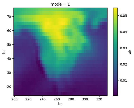
We can next examine the spatial patterns, which are the eigenvectors of the covariance matrix, often referred to as EOFs or principal components.
NOTE: The
xeofslibrary aims to adhere to the convention where the primary patterns obtained from dimensionality reduction (which typically exclude the sample dimension) are termed components (akin to principal components). When data is projected onto these patterns, for instance using thetransformmethod, the outcome is termedscores(similar to principal component scores). However, this terminology is more of a guideline than a strict rule.
[6]:
components = model.components()
components
[6]:
<xarray.Dataset> Size: 22kB
Dimensions:  (lat: 25, lon: 53, mode: 2)
Coordinates:
  * lat      (lat) float32 100B 15.0 17.5 20.0 22.5 25.0 ... 67.5 70.0 72.5 75.0
  * lon      (lon) float32 212B 200.0 202.5 205.0 207.5 ... 325.0 327.5 330.0
  * mode     (mode) int64 16B 1 2
Data variables:
air (mode, lat, lon) float64 21kB 0.0022 0.002131 ... 0.02168 0.0221You’ll observe that the result is an xr.Dataset, mirroring the format of our original input data. To visualize the components, we can use typical methods for xarray objects. Now, let’s inspect the first component.
NOTE:
xeofsis designed to match the data type of its input. For instance, if you provide anxr.DataArrayas input, the components will also be of typexr.DataArray. Similarly, if the input is anxr.Dataset, the components will mirror that as anxr.Dataset. The same principle applies if the input is alist; the output components will be presented in alistformat. This consistent behavior is maintained across allxeofsmethods.
[7]:
components["air"].sel(mode=1).plot()
[7]:
<matplotlib.collections.QuadMesh at 0x7fa2732f75d0>
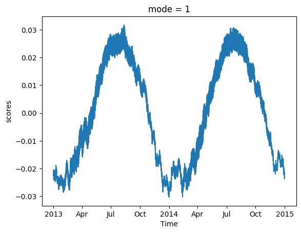
We can also examine the principal component scores, which represent the corresponding time series.
NOTE: When comparing the scores from
xeofsto outputs from other PCA implementations likesklearnoreofs, you might spot discrepancies in the absolute values. This arises becausexeofstypically returns scores normalized by the L2 norm. However, if you prefer unnormalized scores, simply setnormalized=Falsewhen using thescoresortransformmethod.”
[8]:
model.scores().sel(mode=1).plot()
[8]:
[<matplotlib.lines.Line2D at 0x7fa2733f8990>]